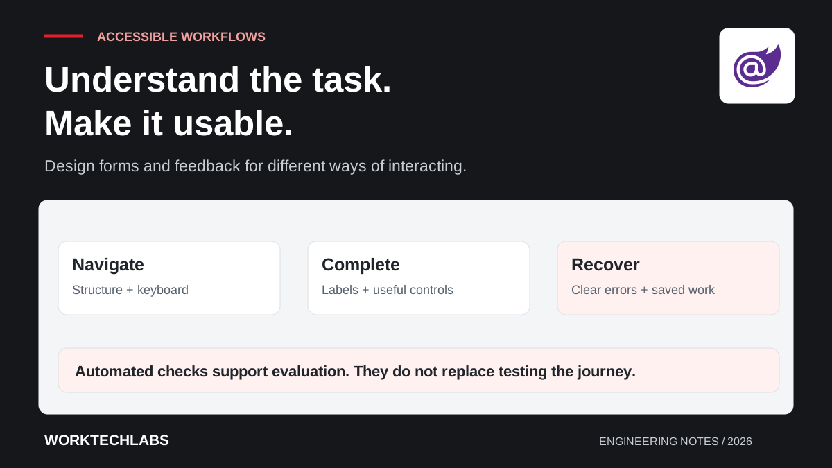
Business applications are often used for hours at a time, under time pressure and in environments that differ from a designer's desk. A warehouse worker may use a small screen, an administrator may navigate mainly by keyboard, and a colleague may rely on a screen reader. Interfaces that assume one way of seeing and interacting can make ordinary work unnecessarily difficult.
Accessibility belongs in the design of the workflow, not only in a final inspection of colours and labels. The practical objective is to help people understand the task, operate the controls and recover from mistakes. Those improvements also make the application easier to test, support and use consistently across a wider range of circumstances.
Start with the complete task
Choose an important journey and follow it from entry to confirmation. Include finding the correct record, entering information, reviewing it and recovering from an error. A form with labelled fields is still difficult to use if the person cannot discover the action that opens it or understand what happened after submission.
Observe how actual users work where possible. Record the devices, input methods and constraints relevant to the task. Avoid assuming that an internal system has a uniform audience simply because everyone works for the same organisation.
For a hypothetical maintenance portal, a technician might need to record a job on a phone while a coordinator reviews the same record on a large screen. Clear structure, understandable actions and a dependable save state help both users, even though their immediate needs differ.
Use controls with familiar behaviour
Prefer appropriate native elements for common interactions. A button should behave as a button, a link should navigate, and a form field should have an understandable label. Recreating these elements with generic containers can require substantial work to reproduce keyboard behaviour and accessible meaning correctly.
W3C's forms tutorial explains practical considerations such as labels, instructions and feedback. Those conventions provide a foundation; the application still needs testing in the context of its complete workflow.
Use custom components when the task warrants them, and treat their interaction design as real implementation work. A date picker, editable grid or searchable selector needs clear focus behaviour, usable keyboard controls and a meaningful representation for assistive technology. Visual resemblance to a standard control does not establish equivalent behaviour.
Make keyboard navigation predictable
Work through the important journey using the keyboard. Check that interactive elements receive focus in a sensible order, that focus remains visible and that users can leave menus or dialogs. A control that can be entered but not exited can prevent completion of the whole task.
Manage focus when the interface changes. After opening a dialog, closing it or showing a validation problem, the user needs a logical place to continue. Avoid moving focus unexpectedly while someone is reading or entering information.
Consider repetitive work. Staff who process many records may benefit from a clear tab sequence and shortcuts that are discoverable and do not conflict with ordinary input. Test these improvements with the relevant users rather than assuming the fastest route for an experienced developer is understandable to everyone.
Explain errors without erasing progress
Tell users what is wrong and how to correct it. A red border alone does not explain which value is invalid or what the application expects. Connect the explanation to the relevant field and provide an overview when several problems prevent submission.
Preserve entered information where appropriate after validation fails. Requiring a person to re-enter a long form can turn a minor mistake into substantial extra work. Make it clear which information has been saved, which remains local and whether navigating away would lose changes.
Avoid messages that expose only a technical failure. “Unable to save because the selected customer is no longer active” gives the user a decision to make. An internal exception name does not. Retain the diagnostic detail for support while presenting a useful explanation and safe next step to the person completing the task.
Design information beyond colour and layout
Use text, structure or symbols with clear meaning alongside colour. Status distinctions such as overdue, pending and completed should remain understandable when colour perception differs or the screen is viewed in poor conditions. Do not rely on a subtle shade change as the only evidence that an important action succeeded.
Organise content with meaningful headings and labels. Long administration pages benefit from a structure that users can scan or navigate through assistive technology. A large bold paragraph is not always equivalent to a heading in the document's structure.
Review tables, charts and images in relation to the decision they support. A chart may need a concise explanation or accessible data view, while an instructional image needs text that communicates its purpose. Decorative imagery should not create extra navigation or repetitive announcements that distract from the task.
Test resizing, small screens and dynamic content
Check what happens when users enlarge text or zoom the page. Important controls and messages should remain reachable, and content should not disappear behind fixed elements. A desktop layout that becomes a narrow collection of columns may need a different presentation for smaller viewports.
Inspect changes that happen without a full page load. Search results, processing status and validation feedback need to be discoverable through the interaction model. Decide which updates should be announced and which would create unnecessary interruption if announced repeatedly.
Use realistic content in these checks. Long customer names, translated labels and detailed error messages expose problems that short placeholder text can hide. Test the states where the interface is under pressure, not only the clean initial screen.
Combine automated checks with human evaluation
Automated tools can identify certain missing labels, structural issues and contrast problems. They are useful feedback during development, but they cannot determine whether a workflow is understandable or whether a custom interaction makes sense. Include manual keyboard checks and appropriate assistive-technology evaluation for important journeys.
W3C's preliminary accessibility checks provide a starting point for basic review. Treat that starting point honestly: passing a small set of checks does not prove that every part of an application is accessible to every user.
Make findings part of normal product work with a reproducible example and a clear expected behaviour. Worktechlabs can help improve business applications and portals through technical and interface reviews. Accessibility work is most useful when it helps a person complete a real task with less uncertainty and fewer avoidable barriers.